Trends
SEARCH BY CATEGORIES
August 7, 2020 – Published in Design & Decor Summer 2014 issue
What’s trending
Words: Caroline Ciantar Barbara
Bring international flair to your home with globally-inspired colours. [Paint companies got their predictions right with the colours revealed for 2014.] These colour palettes show what amazing hues can be found in nature. From pastels to greys, to bright colours, paint brands are all working within their very own interpretation of hues, however the colours all have the same base.
The seaside undoubtedly, is an endless inspiration. What is interesting is the way in which each company has interpreted the colours. Ocean hues vary from mint green to a gentle, pale blue. And every other element has been altered to an amazing range of whites, yellows, pinks and blues.
The atmosphere seems to have been depicted in gentle pastel shades. It is important to note that there will pretty much always be something to suit your style. It is true that they only release one ‘Colour of the Year’, however these paint companies also focus on a few key colours that are present in designers’ collections and interior design projects alike.
This year’s ‘Colour of the Year’ goes by the name of Radiant Orchid. Coming from purple, it is a colour that stimulates creativity and originality – which is very dear in today’s world. This vibrant hue has already popped up in interior designs in walls, upholstery and textiles.
Enhance your interior by including this striking colour in the form of paint, accessories or accent pieces. As a very adaptable colour, it combines well with olive and deep greens – it also works great in an analogous colour scheme when paired with turquoise and teal.
Likewise it also has the ability to jazz up neutral colours like greys, beiges and taupe. Inspirational and bold, without being too intense.
Dazzling Blue can be similar in application. These strong, vibrant colours can also pair well across the palette. They go perfectly with pastels, and can add boldness and animate a space when mixed with other daring colours. Dazzling blue is a remarkable shade of navy which can go nicely with a splash of brass – a shade that makes a real statement – bright with a hint of preppy style. If the colour is too bold for you, introduce it into your décor by teaming it up with white and printed fabric to make sure it stands out.
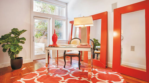
A sharp orange hue called Cayenne is another colour to grace this year’s palette. There’s even spice to its name! With its high pitch, it will definitely add a kick of heat to a room. This will certainly get one’s attention, so perhaps it should be made as a spectacular piece of décor. A stunning night stand, ceramic lamp or cushions in a nice, modern pattern are a few ways of incorporating this fiery colour effortlessly. Another great thing about this colour is that it can divert one’s attention from the less attractive parts of your home like those dishes you forgot to put away!
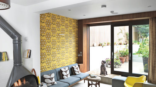
A zesty Freesia also brings light and warmth to our spaces. It’s like opening a window and letting the sun shine through. Yellow is known as a colour that makes you feel good and happy and a little fun fact is that when we’re around yellow, the brain releases more serotonin (the feel good chemical in our brain) – what a happy hue! This makes it a very versatile colour and can easily be applied in bedrooms, bathrooms, living rooms and, why not the exterior? Although we tend to think of yellow as a country colour, it can still work beautifully in a contemporary home. Combine it with nearby cool colours on the palette to tone it down – or let it work its charm with grey and sand tones.
A summery green with a slight tinge of blue, Hemlock is a colour that creates a calm and peaceful atmosphere – it is very similar to mint. It pairs well with bold hues like this year’s Radiant Orchid or other pastels. Most of us are too traditional to take the risk of having a bright colour on our walls – some colours can prove to be a huge commitment, however a colour like Hemlock is gentler and so, more practical. Again this is a colour that goes well with bold shades and won’t need to be applied to entire walls – but how about adding it in the form of wall art? It can also be paired with its complementary, coral for a fresh and modern combination – a mix of colours that is now found in many art prints, pillows and blankets.
Sand, Paloma Grey and Violet Tulip are among other colours that are on this year’s colour palette. These combined with the current floral patterns and geometric prints will create a home that feels sophisticated, contemporary and a space with added interest.
Many of this year’s popular looks are a revival of the colourful décor of the twentieth century. Colour forecasters predicted some hues from the 60s that are now injecting liveliness in the interiors of 2014. Representing happiness and confidence, these vintage throwbacks, together with the revival of patterns and furniture styles, express the trend’s refusal to date.
The most important thing to keep in mind if you want any of these looks, is to make sure that the items you choose are a reflection of your taste. Don’t just fall for the trend, fall for the particular items you think can work within your space. One way of keeping au courant yet making looks like these timeless and certain they keep their appeal to you day after day, is by bringing them into your home with easy updates like a hip art print, a particular fabric, or a new paint job for a cherished piece of furniture.


More Posts
- 91Page 1


